


Why Industry Maps Matter 🗺️ A Closer Look at Gaming 🕹️
A Visual Guide to Making Sense of the Gaming Sector

In our recent piece on Q1 2025 thematic fund performance, we noted that many megatrend themes stumbled. But one industry held up remarkably well: Gaming! 🚀
The VanEck Video Gaming and eSports ETF (ticker: ESPO) delivered strong returns across both time horizons — the challenging Q1 2025 and the broader 2022–2024 period.
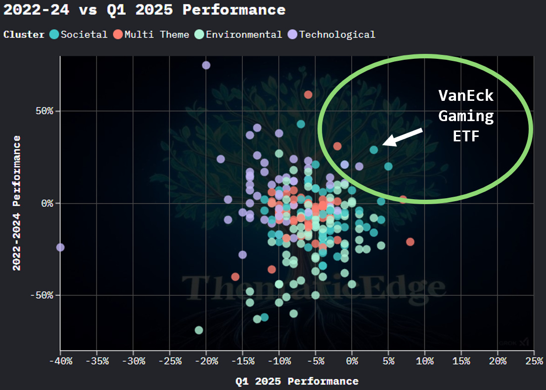
Despite broader pressure on consumer sentiment and tech multiples, gaming showed resilience — supported by strong brand IP, recurring revenues, and enduring demand for interactive entertainment. When a segment shows strength in two very different market environments, it often points to something deeper: a secular growth story worth understanding.
We want to understand this industry better — how it works, where each company plays, and where the most investable opportunities lie. To do that, we want to built an industry map. How can we do this and what would be a good tool to do this methodically?
What’s an Industry Map — and Why Use One?
Think of an industry map as a visual x-ray of a market. It helps answer key questions like:
What are the business models in this space?
Where in the value chain does each player operate?
Who is vertically integrated? Who’s focused on a niche?
Where does the money flow?
One helpful way to frame it comes from Michael Mauboussin and Dan Callahan in their excellent piece, “Measuring the Moat” (Morgan Stanley):
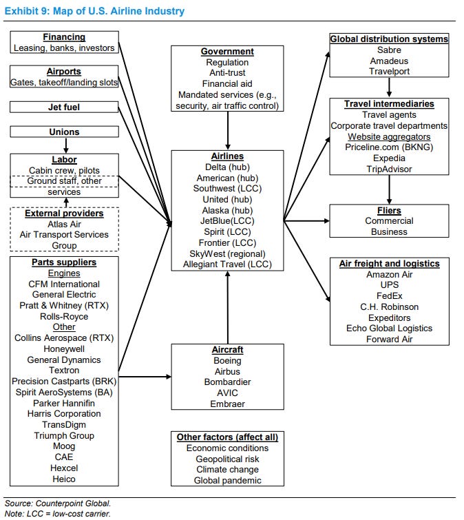
Constructing an industry map is a good place to start the analysis of an industry. (...) The goal is to include all of the companies or entities that may have an impact on the profitability of the firm you are analyzing.
They included an industry map for the U.S. airline industry — which isn’t really driven by a secular growth trend — and I also believe the visualization could be more informative. For instance, major players like airports are missing entirely. I think we can do better, and I’d love your feedback.
A Better Use Case: Gaming Industry Map (Simplified)
Here’s a simplified industry map I built for the gaming sector.
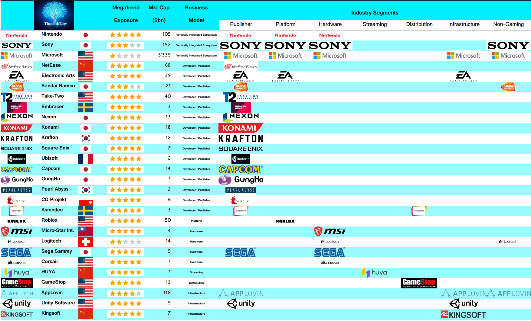
This version captures the core business models. The logos indicate which companies are active in each field:
Nintendo is a pure-play gaming company operating as a Vertically Integrated Ecosystem. It develops, publishes, owns the platform, and also sells the hardware — most notably, the Nintendo Switch.
The same is true for Sony, which owns the PlayStation ecosystem. However, the key difference lies on the right side of the table: Sony also generates significant revenue from non-gaming segments. So while its gaming business is structurally similar to Nintendo’s, it is not a pure play, also visible via the lower “Megatrend Exposure”.
Take-Two, the company behind the Grand Theft Auto (GTA) franchise, is a pure-play developer and publisher. Its DNA is creating compelling gaming content, which is then monetized through platforms like Nintendo (Switch), Sony (PlayStation), or Microsoft (Xbox).
Logitech and Corsair fall into the hardware category, providing physical gaming gear and accessories to players and streamers alike.
You might know the saying, “During a gold rush, sell shovels.”
That’s exactly what AppLovin and Unity are doing. They are infrastructure plays — enabling developers to monetize games via advertising tech, or supporting them with development tools and game engines.
You can immediately see who plays where and who may benefit most from digital trends, cross-platform IP, and rising monetization sophistication.
Going Deeper: Gaming Value Chain Exposure
Here’s a more detailed version. This is how I would structure a market map for my own reference — something I’d keep on my desk.
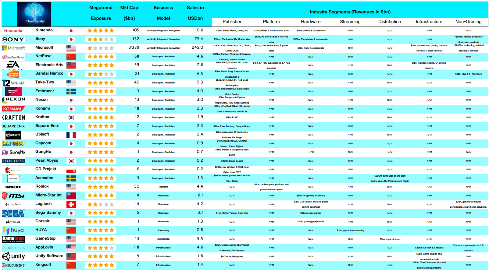
The main differences include:
Revenue breakdowns by segment
A few examples of key products and services
What Else Would Add Value?
I see this industry map as a first step toward identifying compelling stocks and segments within gaming. The natural next step, to me, is to dig into the financials and assess which parts of the industry are more profitable or growing faster than others. I’d be looking at:
Long-term revenue growth patterns
Differences in margin structures and return on capital profiles
Whether this translates into superior shareholder returns
Such a benchmarking deck would help pinpoint which business models and companies are most attractive for long-term ownership.
Once you’ve shortlisted the stocks to prioritize, you’ll probably want to gather additional insights — such as:
Deep-dive investment cases
Podcasts explaining the industry landscape
Interviews with senior executives
Would a curated list of this kind of content be helpful?
Please Let Me Know
Is the simplified industry map too basic — or just right? What would you add?
Is the more detailed version too complex? How would you adjust it?
Would a benchmarking slide deck be useful?
Would a curated list of investment cases, podcasts, interviews, etc. be of interest?
Reply to this post or reach out directly. I'm thinking of adjusting the industry map a bit after your feedback, adding the benchmarking deck, but also layering in external research like investment cases, podcasts, and executive interviews.
The idea is that this format could easily be replicated for other thematic segments with strong secular tailwinds — like semiconductors or defense stocks — helping investors quickly understand who plays where, what drives value, and where to dig deeper.
Don’t Miss Out
If you’re looking to stay ahead of the curve in thematic quality growth investing, subscribe today to receive fresh, insightful posts straight to your inbox.
Thanks for reading ThematicEdge! Your support means a lot.

If you enjoyed what you read, feel free to share it with your friends and colleagues!